
London- and Hong Kong-based design studio Kasawoo turns a once-tired detached house into a cosy nest.
“Small moves, big impacts guided our design philosophy throughout," says Darius Woo, founder of Kasawoo and the creative mind behind this stunning two-tone house in Cambridge, U.K.
Set in a charming residential neighbourhood in suburban Cambridge, the 150 m² house is surrounded by homes predominantly built during the interwar period. Red brick with plaster render finishes forms the typical material language of the area. The house itself, however, had been poorly maintained and was tired from the inside out.
“The house was extended haphazardly over time, resulting in a highly inefficient floor plan that lacked natural light," Woo recounts. "We wanted to bring life and efficiency back to the house while keeping the budget manageable."
The clients, a young couple who moved from London to Cambridge for more space and better schools, were clear on their priorities—creating a home that would grow with their young family while minimising its environmental footprint. “They purchased the derelict property because it presented them with a blank slate to transform into their ideal family home—one that is playful, cosy, sociable, and energy-efficient,” Woo shares. "With a love for patterns and natural materials, they envisioned a space that would evolve with their young family while reducing its environmental impact."
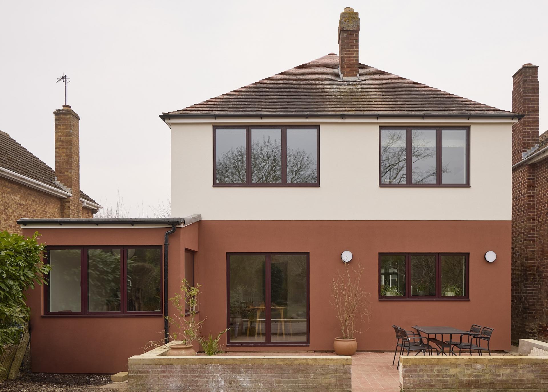
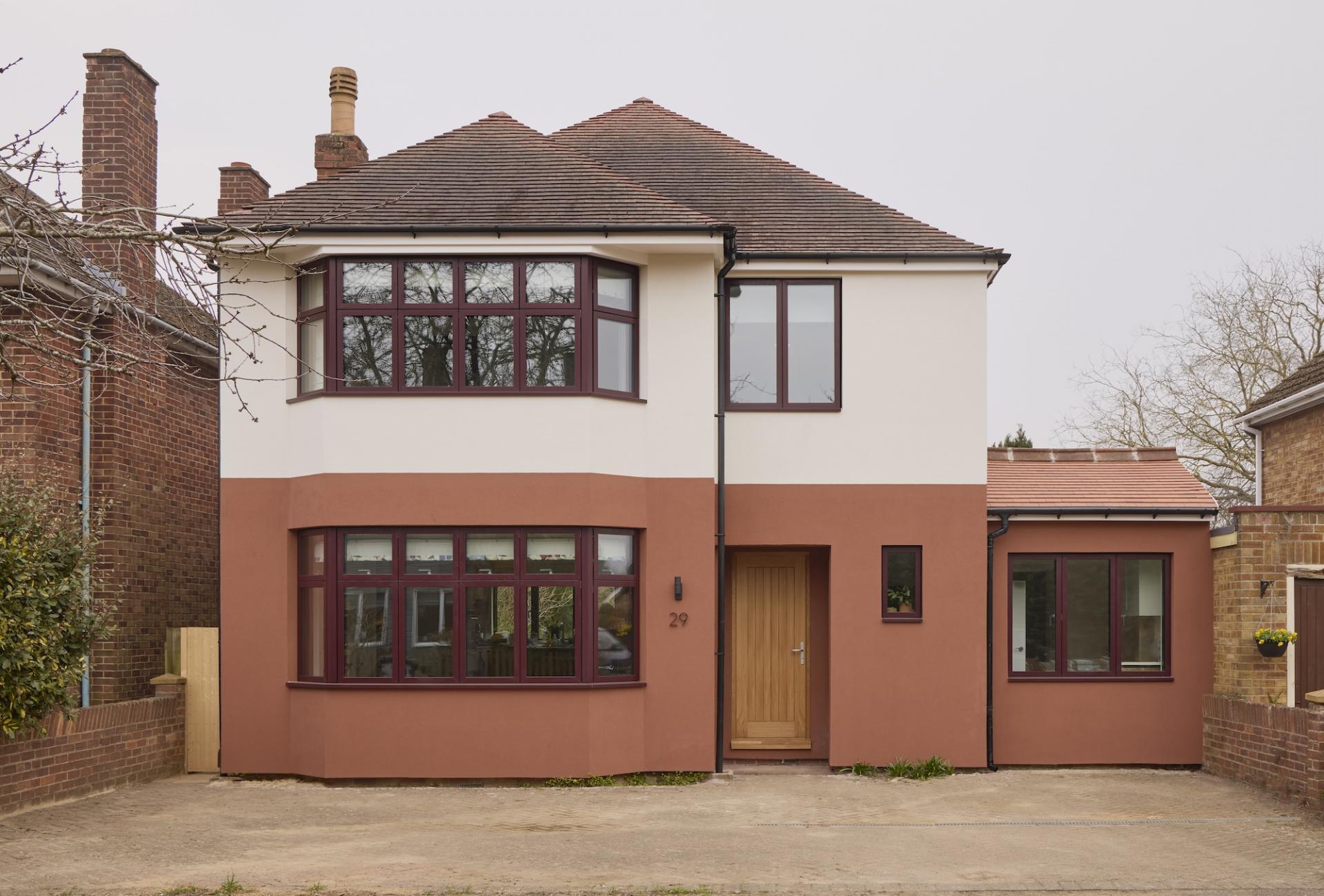
The first thing that grabs you is the façade—a delightful contrast of terracotta red and soft white, punctuated with triple-glazed windows framed in burgundy red. "The terracotta red base, colour-matched to the street’s vernacular red clay bricks, grounds the home in its setting. Meanwhile, the white upper level visually recedes into the sky, lightening the building’s overall massing," Woo explains.
As thoughtful as it is striking, the colour split offers a glimpse into the home’s internal organisation: the ground floor’s lively, social spaces are clad in terracotta, while the restful private areas above are finished in white. “It obviously stands out in the neighbourhood, but yet the proportions and colour feel familiar due to our referencing of the historical datum and proportions as well as extracting the colour from nearby vernacular materials," he stresses. "The resulting two-tone design reflects both the building’s internal layout and its local context."

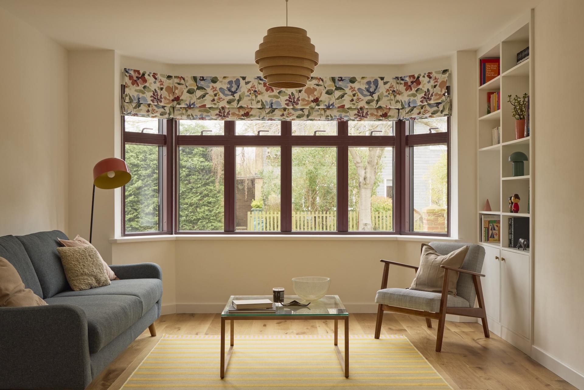
Inside, the calm, pared-back design language—grounded in the "less is more" philosophy—continues the warm, earthy tones of the exterior. “From the outset, we worked closely with the homeowners to craft a personal and cohesive material scheme,” Woo shares. "We picked the colour terracotta as our main palette because it is a colour that can be found in natural materials (tiles, bricks, etc.) and complements very well natural hues (wood, neutral colours, etc.). At the same time, it could also be a really fun accent colour that stands out when paired with more muted tones."

To keep spending and environmental impact to a minimum, Woo optimised the home's spatial organisation while minimising structural changes. A key move was removing a dated and thermally inefficient orangery. Selective interventions on the ground floor enhanced connectivity between previously disjointed rooms.

Existing elements like knee walls and tiled flooring were retained to create the feel of what Woo describes as a semi-enclosed “outdoor room.” This intervention opened up the plan and dramatically improved daylight penetration across the ground floor. “Architecture and design are commonly seen as an additive process,” Woo reflects. “Here, we were interested in the notion that value-adding can also be achieved through the act of reduction and removal.”

In the kitchen, burgundy red cabinet handles tie into the broader colour palette, while beige and oak cupboards add warmth and texture. At its heart, a marble-topped island by Dzek becomes a focal point for the family.

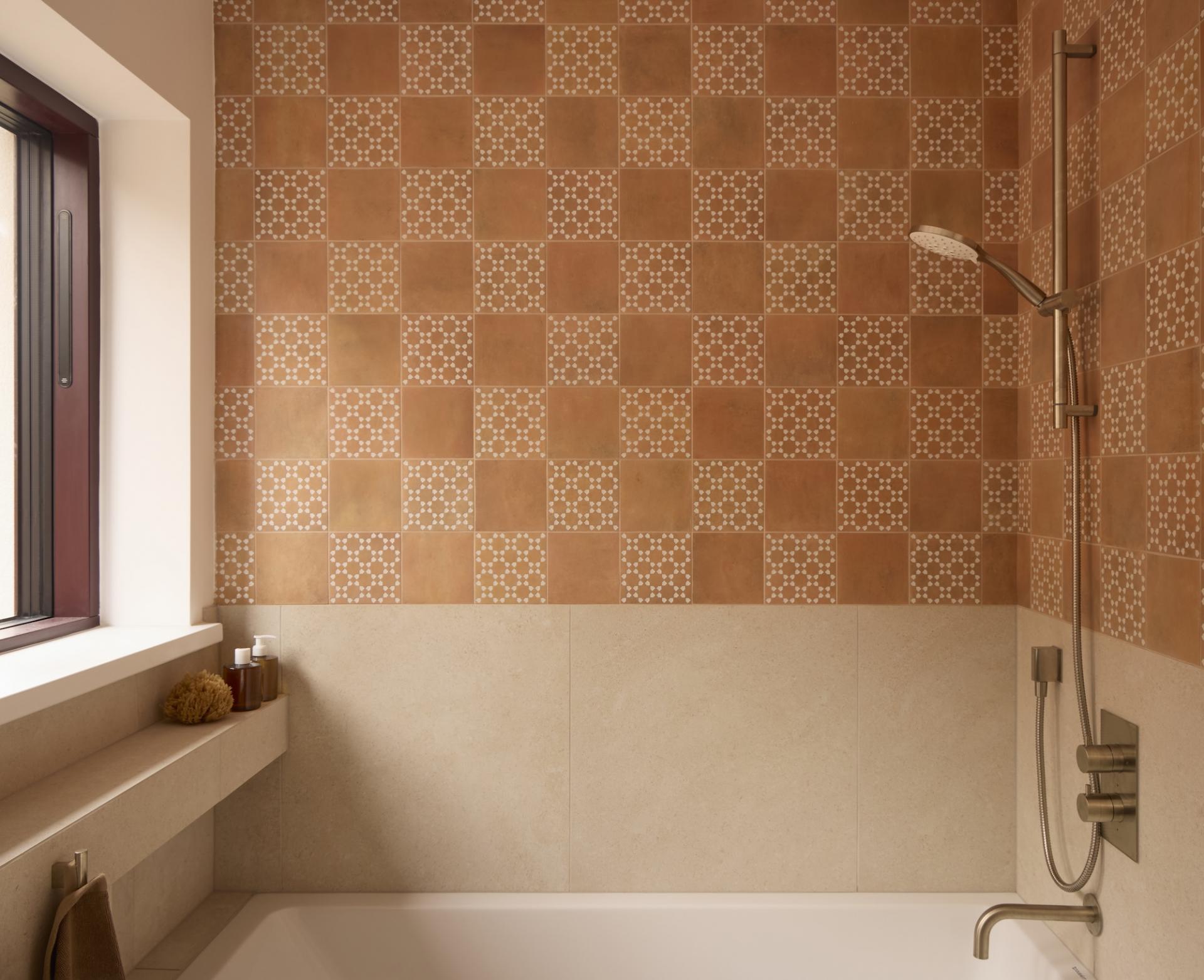
In the bathrooms, the brief was to add a touch of whimsy. “The client was eager to be a bit more ‘fun’ and wanted to experiment with patterned tiles, evoking memories of her childhood in the South of France,” Woo explains. The team sourced terracotta tiles from Mandarin Stone, alternating between patterned and plain designs to avoid overwhelming the spaces.
The project’s biggest challenge? Time. “Designing, coordinating, and completing the project within five months was difficult due to the client’s desire to move in prior to the holiday season,” Woo reflects. “We had to overlap the design and construction phase to achieve the shortened programme. This resulted in a close collaboration and relationship rooted in dialogue and communication between us and the builder.”

The team relied on constant, real-time communication to meet the tight deadline. “We literally had a WhatsApp group chat with the client and the builder where renderings and drawings were shared first-hand as soon as they were done,” Woo shares. “While the process was generally stressful and at times hectic, the result was a deep mutual understanding and respect between everyone involved and a strong buy-in and sense of pride and ownership across the team due to the highly involved decision-making process.”

Equal parts warm and playful, this house manifests how "less is more" can work magic. “The result, we think, is a gentle yet whimsical palette, a scheme that stands out effortlessly,” he concludes.
Photography: Ed Reeve