Whisper colours are tranquil and cleansing. They are at the intersection between committed colours and white. They are there, but barely.


Sea foam, corn silk, alabaster and water chestnut; dove, parchment and opaline… vanilla, cream, oyster and pale ice pink. These colours are not a call to action; they make space for us to think, to quiet our minds, to gentle ourselves. Their nuanced shades create a sense of calm.

There is no palette more conducive to layering than with these whisper shades. They may be subtle (think of them as half tones), but when displayed in varying textures and shades, they can make a huge impact.


The best rooms for layering whisper colours are living rooms and bedrooms, those spaces in which we hope to find calm, serenity and a degree of quiet. These colours are not ideal for rooms reserved for activity, like family rooms or play rooms, or where a great deal of energy is required.

Walls and floors that are stripped down to their original state or white washed will bring texture to the foreground. Marble is a great whisper stone to use because of its cloudy translucency. Sliding shoji screens and handmade paper panels between glass dividers will help to define spaces that are decorated in whisper colours, yet providing necessary grounding for this very ethereal palette.

Texture is critical to showing off this palette. The more subtle the colours, the more texture you will need to create interest and dimension. Of course as a textile designer, I am partial to combining various textures like chenille, velvet, silk, linen, wool, even lurex for a bit of shine. Juxtaposing them in a space with harder surfaces of wood, ceramic and stone in the same palette will give it context.

I love using whisper fabrics for the windows. Vary the light opacity in the fabrics you choose; a sheer transparent layer of drapes will allow light in while also providing some privacy. Add a second track of opaque drapes in a light colour. The combination will give you greater control over the light in the space, and the layers create a rich appearance. In general, this palette likes bright light, which show off its subtleties the best.

Add that bit of lustre or pearlessence to reflect light and accessorise in the same palette. This is best done with objects like vases and trays (think mother of pearl), artwork, or collections of sea shells that sit on side tables or window sills.


The whisper colour world helps us to look inward. They encourage introspection and quietude. Things we all need more of these days!
Breathe. Them. In.
***
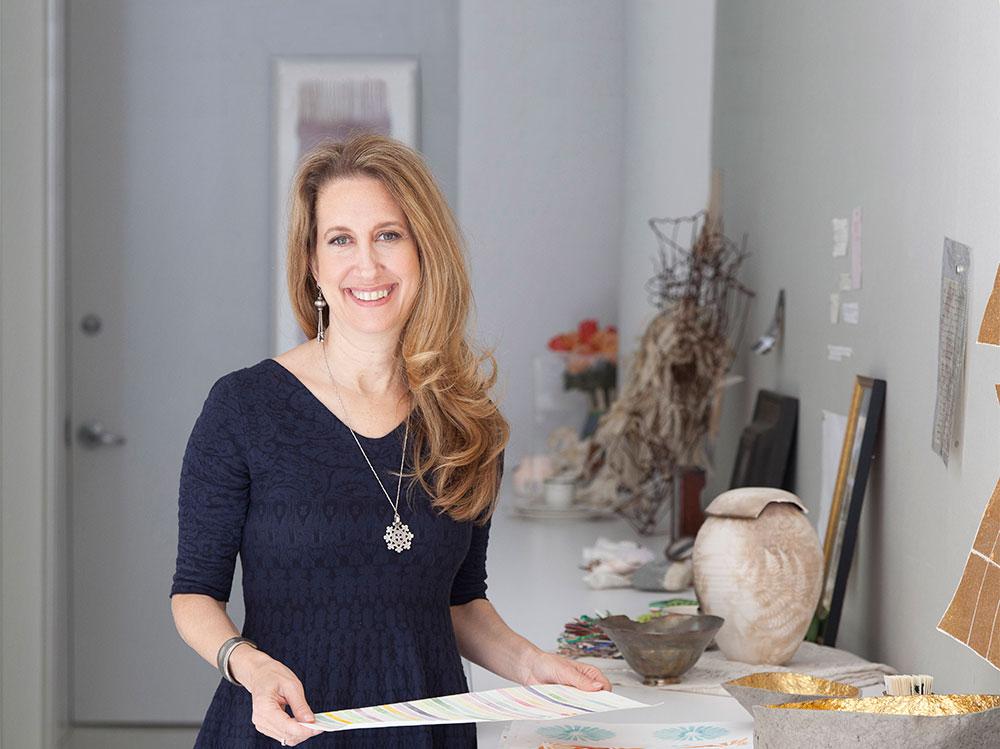
Lori Weitzner, principal and Creative Director of Lori Weitzner Design, is internationally best known for her contributions to the world of textiles, wallcoverings, rugs and passementerie. Her work is housed in the permanent collections of such museums as the Cooper-Hewitt in New York and The Victoria Albert in London and she is the recipient of more than thirty prestigious design awards. She has recently expanded into the fashion world with her first collection of textile infused jewelry and accessories under her own brand. She is the author of Ode to Color, The Ten Essential Palates for Living and Design, published by Harper Collins and lectures around the world on the effects of colour on our wellbeing. Follow Lori on Instagram and Pinterest, and take her color analysis test here.


